best paint brushes to paint the future

Month: April 2026

What Shoulder Boards Say About Brand Identity and Uniforms

For any team in uniform, shoulder boards help turn “clothing” into a system. That system shapes how staff feel in their roles and how customers judge the brand behind them.

What are shoulder boards, and why do they matter?

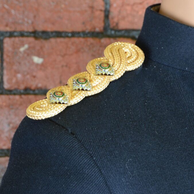
Shoulder Boards are structured pieces worn on the shoulders of a uniform, usually showing rank, role, or qualification. They matter because they standardise how authority and responsibility are recognised at a glance.

When they are clear and consistent, they reduce confusion in busy environments. When they are messy or mismatched, they quietly undermine trust in the uniform and the organisation.

How do shoulder boards communicate brand identity instantly?

They communicate brand identity through visual cues: colour, material, typography, symbols, and how refined the finish looks. These cues tell people whether the brand feels traditional, modern, strict, premium, or practical.

A crisp, well-made shoulder board suggests discipline and investment in standards. A flimsy or cluttered one suggests cost-cutting or a lack of attention to detail, even if the rest of the uniform is decent.

What do shoulder boards signal about authority and competence?

They signal who leads, who supports, and who is accountable in a setting. That clarity influences how the public approaches staff and how quickly issues get resolved.

They also affect perceived competence. When rank and role markers are easy to read, people feel guided. When they are ambiguous, staff may have to explain themselves, which weakens confidence and slows service.

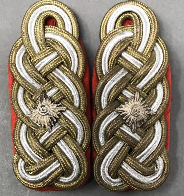
How do colours and materials shape the message?

Colours and materials set the emotional tone of a uniform. Darker palettes tend to feel formal and authoritative, while lighter tones can feel approachable and service-led.

Material choices matter too. Matte finishes can look understated and functional, while polished trims can feel ceremonial or premium. If the brand values “quiet professionalism”, overly shiny elements can clash with that promise.

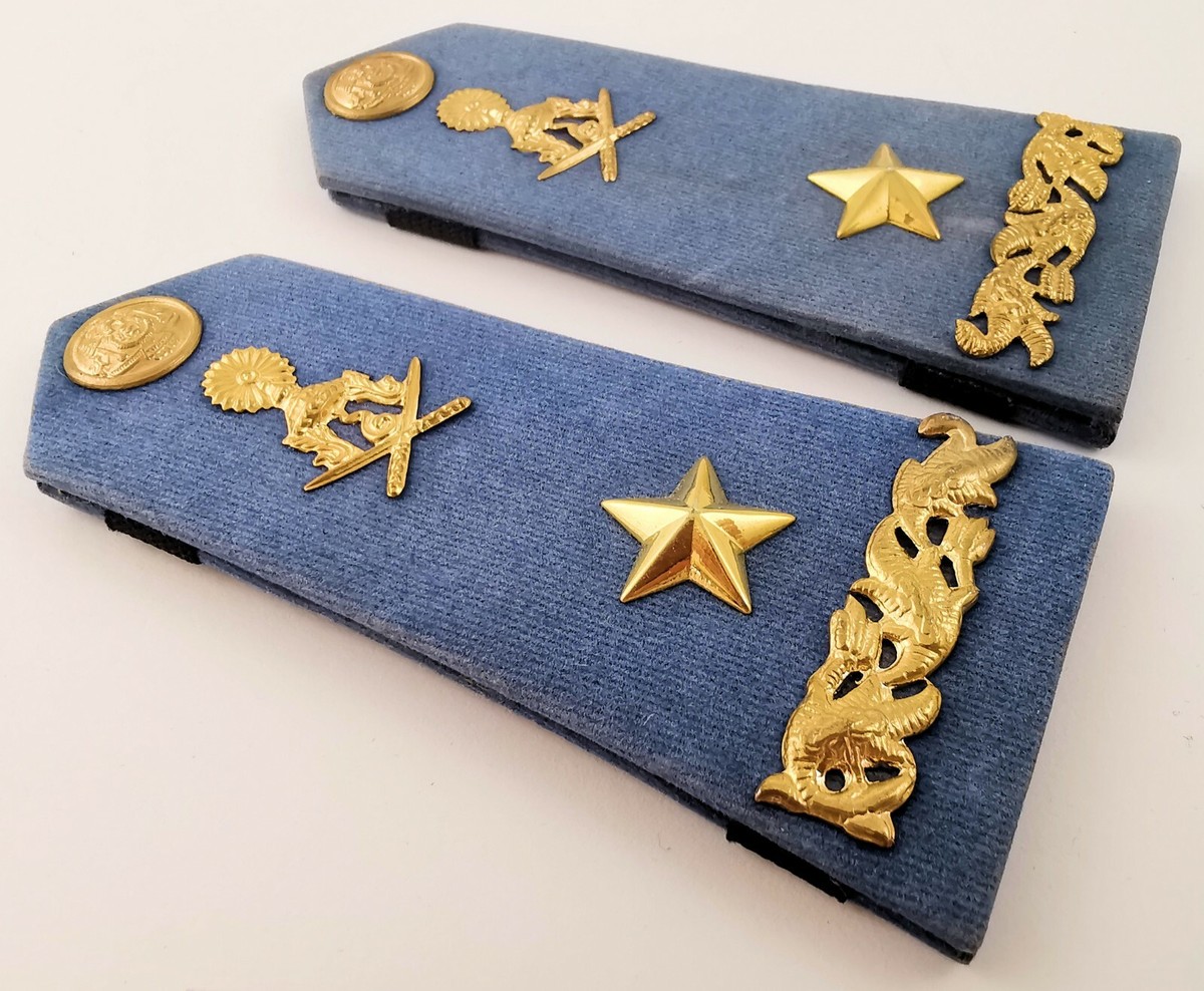
How do insignia and symbols reinforce values and culture?

Insignia and symbols are shortcuts to meaning. A simple stripe system can suggest operational clarity and fairness, while complex crests can signal heritage and tradition.

Symbols also shape internal culture. If qualifications, training milestones, or specialist roles are represented properly, staff feel recognised. If symbols are inconsistent or unclear, recognition feels arbitrary and morale can take a hit.

How do shoulder boards affect customer trust and first impressions?

They influence trust because they make uniforms legible. Customers and the public want to know who can help, who is in charge, and who is responsible.

In sectors like security, aviation, hospitality, and events, shoulder boards reduce uncertainty. That reduction is part of the customer experience, even if customers never consciously think about it.

How do shoulder boards support internal hierarchy without harming approachability?

They support hierarchy by making it visible, but they do not have to create distance. The trick is balancing clarity with warmth in the overall uniform design.

For example, approachable colours, friendly name badges, and clear service roles can sit alongside visible rank. That way, customers still know who to speak to, but staff do not feel uninviting.

What happens when shoulder boards are inconsistent or poorly designed?

Inconsistency creates noise. If different sites, departments, or suppliers produce slightly different designs, people notice the mismatch and assume the organisation is disorganised.

Poor design causes practical problems too. If text is too small, colours are low contrast, or rank systems are overly complicated, the shoulder boards stop doing their job. Staff then rely on verbal explanations, which defeats the purpose. Click here to get about how to design a car air freshener custom strategy that sicks.

How can shoulder boards be aligned with a modern brand style?

They can be aligned by treating them like brand assets, not accessories. That means using the same rules applied to logos and signage: consistent colours, standard spacing, legible type, and a clear system of meaning.

Modern brands often benefit from restraint. Fewer elements, cleaner layouts, and durable materials tend to look more contemporary, and they reproduce more reliably across suppliers and uniform batches.

What should organisations consider before choosing shoulder boards?

They should start with function, then design. The organisation needs to define what shoulder boards must communicate: rank, department, qualifications, or all three, and how quickly that must be understood.

They should also consider wear and maintenance. If shoulder boards fray, fade, or detach easily, the uniform degrades in public view. A simple system that stays sharp after repeated use usually outperforms a complex one that only looks good on day one.

What is the simplest way to get shoulder boards right?

The simplest way is to design a clear, consistent visual system and enforce it. One rank structure, one set of colours, one production standard, and a replacement process that keeps everything matching.

When shoulder boards are treated as part of brand identity, they stop being decoration. They become a small, reliable sign that the organisation knows who it is and runs itself properly.

FAQs (Frequently Asked Questions)

What are shoulder boards and why are they important in uniforms?

Shoulder boards are structured pieces worn on the shoulders of a uniform, typically indicating rank, role, or qualification. They are important because they standardise how authority and responsibility are recognised at a glance, reducing confusion and enhancing trust in busy environments.

How do shoulder boards communicate an organisation’s brand identity instantly?

Shoulder boards communicate brand identity through visual cues such as colour, material, typography, symbols, and the quality of their finish. These elements convey whether a brand is traditional, modern, strict, premium, or practical, influencing first impressions before any interaction.

In what ways do shoulder boards signal authority and competence to customers?

Shoulder boards clearly indicate leadership hierarchy and accountability within a team. When rank and role markers are easy to read, they guide public interactions efficiently, boosting perceived competence and confidence in staff while speeding up service delivery.

Shoulder Boards

How do colour choices and materials used in shoulder boards affect the message they send?

Colours and materials set the emotional tone of a uniform; darker palettes feel formal and authoritative while lighter tones appear approachable. Material finishes like matte suggest understated professionalism whereas polished trims can signify ceremony or premium quality—aligning with the brand’s values.

What impact do insignia and symbols on shoulder boards have on organisational culture?

Insignia and symbols act as visual shortcuts to meaning; simple systems suggest clarity and fairness while complex crests evoke heritage. Proper representation of qualifications or specialist roles fosters staff recognition and morale; inconsistency can cause confusion and reduce team spirit.

Why is consistency crucial when designing shoulder boards for an organisation?

Consistency ensures that shoulder boards effectively communicate hierarchy and brand identity across all sites and departments. Inconsistencies create confusion, undermine professionalism, suggest disorganisation, and may force staff to explain their roles verbally—defeating the purpose of clear visual communication.

How to Design a Car Air Freshener Custom Strategy That Sticks

What should a “custom strategy” actually include?

A strategy should cover the goal, the audience, the format, the fragrance direction, the visual design, and the distribution plan. If any one piece is guessed, the final product often feels generic, performs poorly, or gets thrown away. A simple framework is: purpose first, then usage context, then design and scent, then fulfilment and feedback.

Who are they trying to influence, and where will it be used?

When planning a Custom Car Air Fresheners, they should define whether it is for customers, staff, event attendees, or resale. A commuter in a small hatchback experiences scent differently from a rideshare driver with constant passengers, or a family car that needs “clean” rather than “sweet”.

They also need to decide if this is a one-off giveaway or a repeatable campaign. Repeat campaigns benefit from consistent shapes and branding, with seasonal fragrance rotations.

What goal should the air freshener serve for the brand?

They should pick one primary goal: brand recall, customer delight, lead generation, or revenue. If the goal is recall, the design must be instantly recognisable and kept simple. If the goal is lead generation, the packaging and CTA matter more than complex artwork.

They should also decide how success will be measured, such as reorder rate, QR scans, redemptions, or social mentions, rather than relying on “people seemed to like it”.

Which format and materials tend to “stick” in real cars?

They should choose a format that suits how people actually use cars. Hanging card fresheners are familiar, cheap, and easy to distribute, but can fade faster in heat. Vent clips often feel more premium and distribute scent steadily, but cost more and need compatibility checks. Gel fresheners and jars can work well for cup holders, but are more visible and can clash with minimal interiors.

For most campaigns, a hanging card is the simplest starting point, with thickness and coating chosen to balance print quality and scent release.

How should they choose a fragrance that people will not hate?

They should aim for broad appeal, not novelty. Clean, subtle profiles typically perform best for mass audiences: “fresh linen”, light citrus, soft lavender, or mild ocean notes. Heavy gourmand scents can polarise, and strong musks can trigger complaints.

They should also consider sensitivity. A lighter scent level with steady release usually creates fewer negative reactions than an intense burst. If possible, offering two fragrance options reduces risk and makes the campaign feel intentional.

How can the design look premium without becoming cluttered?

They should treat the air freshener like a tiny billboard. The most effective designs usually include one hero visual, the brand name or mark, and a short line if needed. Overly detailed artwork often prints muddy at small sizes and becomes unreadable in motion.

They should use high-contrast colour choices, avoid tiny text, and keep the logo placement consistent. If they want extra information, it belongs on the packaging, not on the freshener itself.

What should the CTA be, and where should it go?

They should keep the CTA simple and realistic. A QR code can work, but only if it links to one specific action: a discount, a waitlist, a map link, or a short landing page. Putting multiple links or long URLs usually fails.

The CTA is best placed on the sleeve or backing card, where there is more space and less visual noise. If they must include a QR on the freshener, it should be large enough to scan quickly and tested on a phone camera.

How should they package it so it arrives fresh and feels intentional?

They should use sealed packaging that prevents scent loss during storage and shipping. A branded sleeve can make even a low-cost item feel premium, and it also gives space for instructions and legal notes.

They should include simple usage guidance, such as removing it from packaging gradually if the scent feels strong, and avoiding contact with dashboards or surfaces that could be marked by oils.

How should they plan distribution so the product does not get wasted?

They should match the channel to the audience. Events and in-store handouts work when staff can explain the scent choice and packaging. Online order inserts are excellent when they want repeat exposure, especially if the customer already likes the brand. Local partnerships, such as car washes or garages, can scale distribution if the co-branding is handled cleanly.

Car Air Freshener

They should also control timing. Sending fresheners in peak summer heat can change how a scent is perceived, so seasonal drops often perform better. Click here to get about what shoulder boards say about brand identity and uniforms.

What common mistakes stop a custom freshener strategy from working?

They often fail when they choose a scent they personally like rather than one the audience tolerates daily. They also fail when the design is treated like a flyer, crammed with details that cannot be read. Another common issue is ignoring the car environment: heat, sunlight, and small enclosed spaces make “normal” fragrance strength feel overpowering.

Finally, they fail when there is no follow-up plan. A freshener can create a moment, but the brand needs a next step to capture the value.

How can they test and improve without overspending?

They should start with a small batch across one or two scent options and a single design direction. Then they can gather lightweight feedback via a QR survey, customer support tags, or simple reorder behaviour. If complaints cluster around intensity, they can adjust fragrance load or packaging instructions before scaling.

A second iteration should focus on one improvement at a time, such as changing scent family, simplifying the artwork, or upgrading packaging.

What does a “stickier” strategy look like in practice?

A stickier strategy is one where the fragrance is broadly liked, the design is instantly identifiable, and distribution repeats often enough to build memory. They should plan for consistency, not one-off cleverness.

If they want the simplest path: choose a clean crowd-pleaser scent, use a bold minimal design, add a single CTA on premium packaging, and run it as a repeatable insert or local partnership campaign. That is how a custom car air freshener becomes a brand asset rather than a novelty.

FAQs (Frequently Asked Questions)

What key elements should a custom car air freshener strategy include?

A comprehensive strategy should define the goal, target audience, format, fragrance direction, visual design, and distribution plan. Following a framework of purpose first, then usage context, design and scent, followed by fulfilment and feedback ensures the final product aligns with brand objectives and resonates with users.

How do I choose the right fragrance for a custom car air freshener?

Opt for broad-appeal scents like fresh linen, light citrus, soft lavender, or mild ocean notes to suit most audiences. Avoid heavy gourmand or strong musk fragrances that may polarise users. Consider scent sensitivity by selecting lighter scent levels with steady release and, if possible, offer two fragrance options to reduce risk.

Which formats and materials are best suited for car air fresheners?

Hanging card fresheners are cost-effective and familiar but may fade faster in heat. Vent clips feel more premium with steady scent distribution but cost more and require compatibility checks. Gel fresheners fit cup holders well but can be visually intrusive. Starting with a hanging card balancing print quality and scent release is often the simplest approach.

Car Air Freshener

How can I design a premium-looking air freshener without clutter?

Treat the air freshener as a tiny billboard featuring one hero visual, the brand name or mark, and a concise line if needed. Use high-contrast colours, avoid tiny text, and maintain consistent logo placement. Reserve extra information for packaging rather than the freshener itself to keep the design clean and readable.

What are effective ways to include a call-to-action (CTA) on custom car air fresheners?

Keep CTAs simple and focused on one specific action such as discounts or landing pages. Place QR codes on sleeves or backing cards where there is ample space and less visual noise. If including a QR code on the freshener itself, ensure it is large enough to scan quickly and tested across phone cameras for usability.

How should I plan distribution to maximise impact and minimise waste of custom air fresheners?

Match distribution channels to your audience—events and in-store handouts allow staff explanation; online order inserts promote repeat exposure; local partnerships with car washes or garages can scale reach if co-branding is handled cleanly. Also consider timing to avoid peak summer heat which can alter scent perception; seasonal drops often perform better.

© 2026 Arts Freedom AU

Theme by Anders NorenUp ↑